Where the Eye Lands First: Visual Hierarchy in a Painting
Visual hierarchy in a painting reveals how contrast, scale, placement and direction organise the composition, helping you map its visual structure clearly.
Where does your eye land first, and what makes it move? Visual hierarchy in a painting describes how contrast, scale, placement and direction organise the composition. Instead of trying to settle what a painting means, you can map how its parts relate and see which visual choices shape that route.
A bright edge, a large form or a line of sight can pull attention in different ways. The first detail you notice may be only an entry point: another shape can redirect your gaze, balance the composition or interrupt its movement. Keep the focus on those relationships rather than treating the image as a scene to decode.
Map the composition before naming its subject
Choose one painting and stand where you can see its full surface comfortably. Before reading the label, note the first area that catches your eye, then identify what your gaze visits next. Record positions and visible qualities, such as “dark form at the lower right” or “sharp diagonal towards the centre”.
Now look away briefly and return to the painting. If your gaze lands in the same place, that area has a strong pull for you at this moment. If it shifts, the composition may offer competing points of entry, or a nearby detail may have changed how you read the whole arrangement.
Draw a rough rectangle on paper and mark the first landing point with a dot. Add arrows for the next places you look, with a short note beside each one: “bright patch”, “curved edge” or “overlapping shapes”. This map is a record of spatial relationships, not a verdict about the artwork.
Compare the contrasts that make forms stand apart
Contrast is a difference that gives one area greater visual force than its surroundings. Look for light against dark, vivid colour beside muted colour, a crisp edge beside a soft one, or a dense passage beside open space. Compare those shifts with the route you mapped.
Narrowing your eyes slightly can soften small details and make larger differences in light and dark easier to see. Check whether a dark figure against a pale wall pulls attention more strongly than the fine marks on its clothing. Then open your eyes normally and look for colour and edge contrasts that may have been less obvious.
A strong contrast can catch your eye without holding it. A bright patch might lead you towards a nearby face or doorway, while a quieter area gives the composition balance. Like a coloured tab on a file, contrast helps you locate something; the surrounding arrangement tells you how that detail connects to the rest.
Read scale, placement and empty space together
Compare the relative sizes of the forms. A large figure may dominate even with subdued colour, while a small, sharply defined object can stand out among broad, simple shapes. Ask whether a form is large in the painting, large beside its neighbours, or both.
Next, divide the surface loosely into upper and lower, left and right, centre and edge. Notice whether forceful forms cluster together or pull your gaze between separated areas. Central placement can make a form immediately accessible, but an off-centre shape may command attention through contrast, scale or its relationship to surrounding space.
Look at the room left around each form. Open space can separate shapes or make one seem more prominent without a dramatic colour difference. In a crowded passage, a small form may remain hard to spot until a line or contrast points towards it.
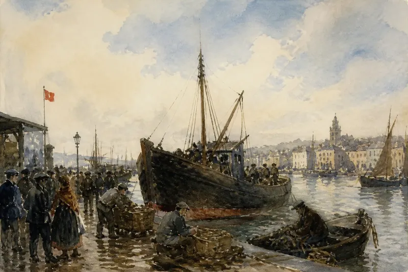
Say you are looking at an invented painting of a crowded harbour. A broad pale sky fills the upper half, a small red flag sits near the left edge, and a dark boat occupies the centre. You first mark the flag, then draw an arrow to the boat because its larger shape takes up more visual space; the map shows that the flag attracts attention while the boat anchors the arrangement.
Trace the lines that organise movement
Look for directions made by roads, branches, shorelines and architectural edges. Gestures can do similar work: a tilted body, an outstretched arm, a gaze or a row of repeated objects may guide your eye. Follow each direction and mark where it leads on your map.
Some routes are implied rather than drawn. Overlapping forms can carry the eye from foreground to distance, while aligned figures create a path across the surface. Note where movement pauses or changes direction, perhaps at a face looking outwards or a strong vertical form crossing a diagonal.
One shape may also lead towards another whose gesture points back, creating a loop. If your gaze keeps circling, mark where the circuit begins and what sustains it. Describe the visible pattern first; ideas about the scene can follow without being mistaken for evidence of a single intended meaning.
How do you map a painting’s visual hierarchy?
Does the brightest area always lead the composition?
No. A face, a large shape or a directional line can pull attention more strongly than a bright patch. Compare what you noticed first with the strongest differences in colour and light.
How can you distinguish a focal point from a passing detail?
Check whether your gaze returns to the detail and whether other shapes or lines direct attention towards it. If it catches you once but does not organise the route, record it as an attention-grabbing feature rather than the composition’s sole centre.
Can a painting have several centres of attention?
Yes. Areas can compete, alternate or connect in a sequence. Mark the route you experience instead of forcing the composition into a single-centre reading.
What should you do if the route changes on a second look?
Draw a second route in a different colour or with a different line style. Compare the maps to see which cues stayed prominent and which became noticeable only after you had studied the arrangement.
Use a composition-focused looking checklist
For each item, record the observation and use the result to decide what to inspect next.
- First landing point: Check where your gaze settles on returning to the whole painting; if it lands in the same area, mark that point as a strong entry, but if it shifts, map both points as competing entries.
- Light and dark: Check which area has the clearest value contrast; if it matches your first landing point, compare its nearby edges, but if it does not, look for scale or direction that explains the difference.
- Colour: Check whether a vivid patch stands apart from nearby colours; if your gaze stops there, inspect what surrounds it, but if your gaze moves on, draw an arrow towards the next form.
- Scale: Check which form is largest relative to its neighbours; if it also holds your attention, mark it as a dominant shape, but if it does not, compare its contrast and placement with the smaller forms.
- Placement and space: Check whether a form sits alone or within a crowded area; if open space makes it stand out, mark the surrounding gap, but if it remains hard to see, trace a line or colour echo towards it.
- Direction: Check where a gaze, gesture or architectural edge leads; if it reaches another noticeable form, connect the two on your map, but if it stops abruptly, mark the interruption and inspect the nearby shapes.
- Repeat visit within the session: Check whether your gaze returns to the first point after following the route; if it does, draw a loop, but if it does not, mark the final resting point as a separate part of the composition.
Use your map to compare the painting’s structure
Read the arrows back in order. Does the route travel from foreground to background, circle a group, or jump between opposite sides? If your arrows cross open space, look for an alignment or repeated colour that might connect the areas. If a jump remains abrupt, leave it marked as a break rather than smoothing it into a neat path.
Compare the route with the distribution of size, contrast and space. A strong feature may act as an entrance while another form steadies the composition; the two roles do not have to belong to one object. If you later read the label, return to the painting and note whether that information changes which relationships you notice.
Keep the map beside a short note naming one concrete relationship, such as “the diagonal leads from the lower edge to the pale face, while the dark mass balances it”. Visual hierarchy in a painting becomes clearer when you compare those relationships across the whole surface, rather than giving every noticeable detail the same weight.